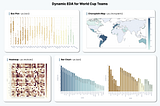
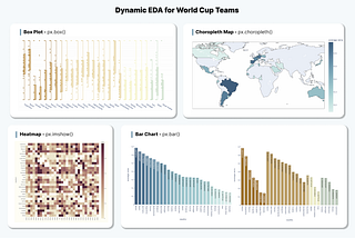
InTDS ArchivebyDestin GongHow to Use Plotly for More Insightful and Interactive Data ExplorationsCase Study: Dynamic EDA for Qatar World Cup TeamsDec 13, 20221Dec 13, 20221
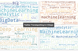
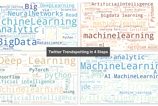
InDev GeniusbyDestin GongHow to Visualize Twitter Trends in 4 Simple StepsA Swift Approach to Spot Trending Topics in 10 MinutesJun 14, 2022Jun 14, 2022
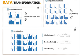
InTDS ArchivebyDestin Gong3 Common Techniques for Data TransformationHow to Choose the Appropriate One for Your DataAug 1, 20212Aug 1, 20212
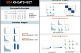
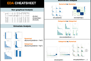
InTDS ArchivebyDestin GongSemi-Automated Exploratory Data Analysis (EDA) in PythonComprehensive Data Exploration Process with One-ClickMar 1, 20219Mar 1, 20219
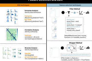
InTDS ArchivebyDestin GongFeature Selection and EDA in Machine LearningHow to Use Data Visualization to Guide Feature SelectionMay 24, 20212May 24, 20212
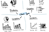
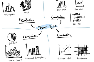
InTDS ArchivebyDestin GongHow to Choose the Most Appropriate Chart?Line chart, bar chart, pie chart … they tell different storiesNov 20, 2020Nov 20, 2020
InAnalytics VidhyabyDestin Gong3 UX Design Principles for Better Data VisualizationCreate dashboards that deliver insights FASTSep 15, 20201Sep 15, 20201
InAnalytics VidhyabyDestin GongHow to Learn Data Visualization for FreeVisualization Tools + Learning ResourcesOct 18, 2020Oct 18, 2020
InAnalytics VidhyabyDestin GongHow to Download and Learn Tableau for FREEstep by step guide to unlock your data visualization journeySep 22, 2020Sep 22, 2020